1 November 2022
Dark mode
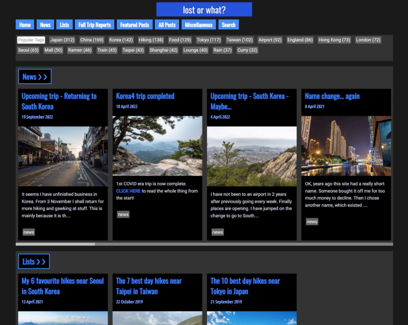
I have changed my whole site to be dark mode. Dark mode is everywhere now. I think it might even be default mode on Windows 11? So to de-boomerize myself, here it is, dark mode. It is also blue instead of red.
Actually there are some other improvements also, the photos will generally take up more real estate on bigger screens and show higher res versions, but it should still work on phones etc as well. It is a bit tricky to cater for everything and I am not sure how the font scaling is handled for all you guys with weird 5k screens with odd scaling - a pixel ratio purely designed to break all sites not specifically designed for the think different kool aid crew.

A screenshot of dark mode. When I eventually switch to bright green mode or whatever the next trend the kids demand is, this will be a reminder of how dated my site looked when it was dark mode.