17 February 2019
Lets get overly technical
As the title suggests, this is going to get really technical. I will be discussing Adobe Lightroom, retina screens, css resizing, view portals, ICC color profiles, raw vs jpg files... oh my.
As usual I am going to write this assuming someone cares, chances are, no one does, yet, maybe I will go viral one day due to one of these idiotic psychopathic rants?
For a month or so now I have been trying to 'fix' my pictures, this has posed no end of problems. Allow me to explain.
On each of my boring self indulgent trips, I take a small laptop with me, use Adobe Lightroom as my photo cataloguer / editor, shoot either jpg (in the past) or raw (now) photos, do some minor (in the past) or major (now) edits in Adobe Lightroom, before exporting them to a couple of different sizes and uploading.
The size of files required has increased over my many years of aimless wandering, originally no one had a screen bigger than 1024x768 pixels, and most people had 800x600. I think at that time when I exported the preview images, which is all 99% of people see, at only 300 pixels wide!
Fast forward now to 2019, and we have a much much more complex world, which I shall try and explain, but first....
Many years ago I either had a camera that did not shoot raw, or chose to shoot jpeg because I did not understand why I would bother with raw. In fact at various points I did not use an editor program at all, I exported jpegs straight out of camera (SooC) and used a resizing tool embedded into the windows shell.
Fortunately, I still have nearly all the original higher megapixel jpegs, and I certainly have all the raws from the last few years since I first swapped to a Fujifilm x70 and then more recently a Sony a7ii. Well actually I lost about a dozen which infuriates me because I dont know how it happened but thats a different rant about backups...
So what does that mean? It means I have an opportunity to go back and re edit older trips in lightroom, and export at higher resolution. My current preference is the previews are to be 800 css pixels wide, where as the full size images will be 1600 css pixels wide. More on css pixels later. To hold your interest (who am I kidding? no one read this far!), below are examples of original and re-edited photos from my full lap of Taiwan trip in 2017.
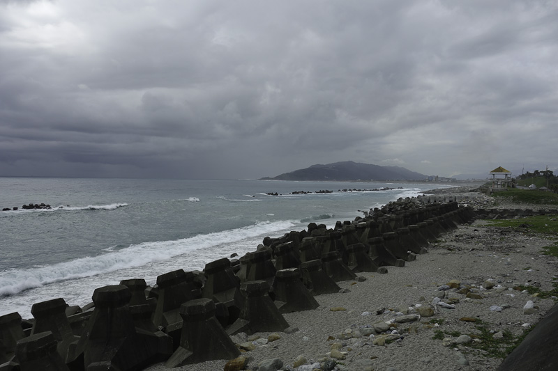
A pre edit shot during the day, very dark, black shadows.
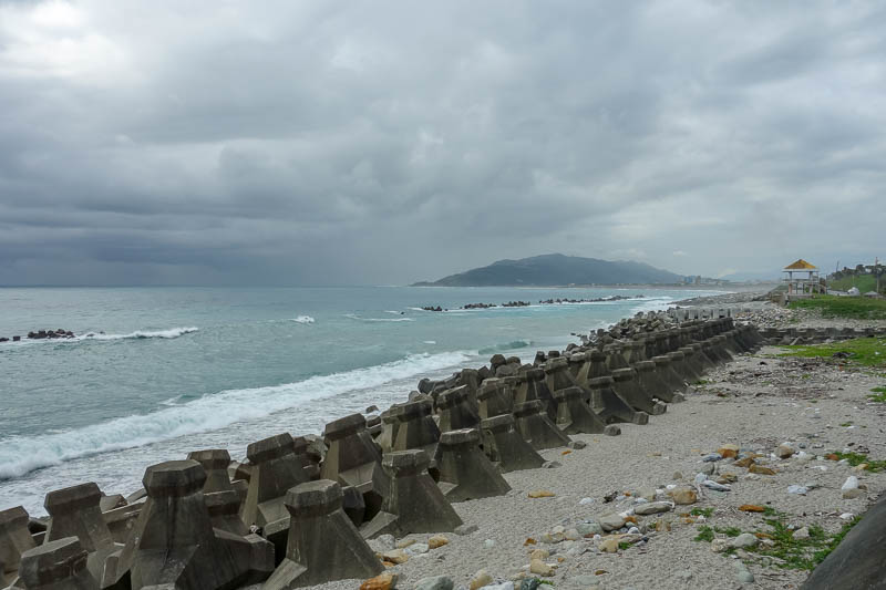
Re-edited version, lots more to see.
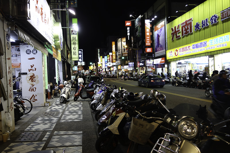
A pre edit shot of some neon at night, signs blown out, shadows too dark.
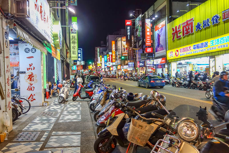
A re-edited version, hopefully it looks better... possibly over-saturated but that's my preference. I LIKE EYE CANCER! The signs should be less blown out, the shadows should no longer be black.
OK, now that we have got the re editing out of the way, its time to explain the failing of taking photos using in camera jpeg conversion as opposed to raw.
My old Sony RX100 mk1 served me well for many many years. I still have it, it still works, the optical stabilisation servo buzzes like mad and the strap lug ripped off the side but as far as I can tell it still takes photos as well as it did the day I bought it.
It only has a 1 inch sensor, so its low light performance is really poor compared to say, a full frame Sony a7ii, however to compensate I frequently used the RX100's multiple frame noise reduction. Most people do not understand this feature, it effectively stacks a lot of noisy high ISO images on top of each other, lines them up and removes the noise by averaging the pixels across 5 or so frames. The downside, you have to disable raw capture to use it. So I did.
The impact I can see now is that because I was using MFNR (multi frame noise reduction) I messed with the jpeg engine in my Sony RX100 a lot, to produce SooC (straight out of camera) images that to my eye looked sharp and vivid. These are generally badly over-sharpened, and now there is nothing I can do about that. They look fine from afar, but have a 1:1 peak and you have a water color painting as shown below.
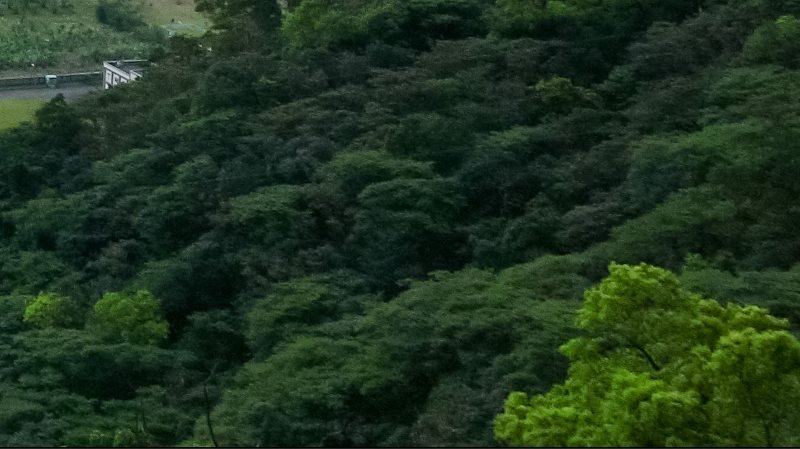
An example of an over-sharpened jpeg from my Sony RX100. Nothing I can do about that now, it is worse where there is lots of green and darker scenes which probably used Multi Frame Noise Reduction. The lesson here, always shoot raw in case years later the technology exists or demands that you stare closer at the pixels.
Now for my next failing. Exporting and importing Lightroom catalogues. As mentioned, while travelling I use a small laptop, import my photos, do my edits, export, upload.
When I return from my trips, I reimport my photos from the SD cards, I don't delete the files from the SD cards while travelling, as I consider the tiny fragile easily lost cards to be an extra backup.
Anyway, what I should do after reimporting those files onto my home pc, is export the catalogue from my laptop with all the edits, photos marked for rejection, processing history etc. Until my most recent Japan trip I have never done that. Epic fail. I am repopularizing the term epic fail by the way.
This was never a big issue until I wanted to go back and re export all the raws from trips many years ago. You see like most people, I take about 50% more photos than I end up using. When I get back to my hotel room each night, I go through the photos from the day, mark some of them as rejected, edit the 'keepers' then export and upload. By not exporting and importing the catalogue I lose all the data about which are keepers, as well as all the edits, including cropping, that I performed while I was on my trip.
So now I have to go through 1500 photos to identify the 1000 keepers (per trip!), and start editing all over again. That is very time consuming!
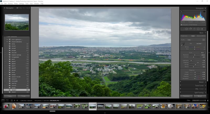
Here is what Adobe Lightroom looks like in 2019. This is after I have gone through and rejected all the unused photos from my Full Lap of Taiwan trip and re edited all 933 photos.
If you are still following along, now its time to get even more technical. Who is excited? Oh that's right, no one reads this.
Anyway, its now time to talk about ICC color profiles, color space (also known as color model or color system) and imagemagick.
The reason I have re-edited and uploaded the aforementioned Taiwan trip first is because I made a stupid error in Lightroom that I have only properly resolved by re editing and exporting all those photos.
In 2017 just before going to Taiwan, I reinstalled Lightroom on my travel laptop. This reset everything, it has lots of options. For some reason when I went to export photos, I did not notice that the color space was not sRGB. It was ProPhoto RGB. There is also Adobe RGB. Maybe you have heard of RGB, it means red green blue. Your monitor / screen displays pixels in these colors. There is also CMYK, used more for paper printing, which means Cyan, Magenta, Yellow, Key. Lets not worry about that for now.
sRGB is the most common, and its the only one that is properly supported by all browsers. It is also the least colorful RGB color space.
You see, when we look at red, green, blue etc on our monitor, we are not seeing something that is as red as it can be, or as blue as it can be. It is impossible to display those reds on a monitor that does not support ProPhoto RGB or Adobe RGB.
The issue is, if you export a file using ProPhoto RGB and attempt to display it on an sRGB monitor, it will appear dull and muted.
I have done my best to illustrate this below by exporting a photo as ProPhoto RGB, taking a screen-capture, saving the screen-capture etc. I think this would therefore display dull and muted even if you are lucky enough to have some kind of super monitor and browser capable of displaying ProPhoto RGB correctly.
Just before I share the horrific comparison, I will describe how I thought I fixed this.
There is a tool, imagemagick, which is fantastic, a command line utility primarily for Linux. This allows you to do about a million things, including changing the color space. For years I thought after I ran a large bash command on my Taiwan4 directory I had fixed this, but alas I had not. You see I had converted to sRGB2016, which is some sort of other half fixed barely documented profile that no one uses.
Hence as you will see, further reason to re-import, re-reject non-keepers, re-edit, re-upload. So much re.
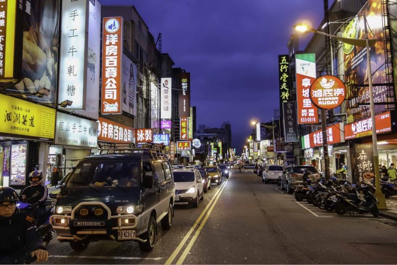
Here is what my Full Lap of Taiwan photos originally looked like, when erroneously exported as ProPhoto RGB. Dull, Muted. As mentioned I kind of sort of fixed them with Imagemagick, but they were still sort of wacky. This fix is different to the one above which was simply not editing aggressively. In this image, look at anything that should be red, green or blue, and note how it is not FULLY red, green or blue.
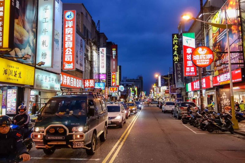
And here is the exact same photo, same edits as above, exported correctly with the narrower gamut sRGB color profile. Much more vibrant. Happy times. Also how often do you get to use the word gamut!
Now we get to the final problem (or is it?), which is also the hardest to explain, the effect of HDPI screens. The acronym alone is confusing since it either means high dots per inch, or high density per inch or high density pixels or high dot density per pixel inch or hotdog pickles. Nobody knows.
Anyway, Apple at least popularised the concept, and to understand it correctly, you need to understand what is meant by CSS width or viewport width and how that differs from pixel width. I am already confused.
Take a deep breath.
If you have an HDPI or Retina screen, and you are browsing the internet, you might have a screen that is 2880 pixels wide (common size of current Macbook pro.... I think).
However despite having 2880 pixels of width, the browser (Safari, Chrome, Firefox, Edge etc) automatically zooms all HTML content apart from images to 200%, e.g. 1440 pixels wide. I think this is done at the operating system level. Without this, a full screen web page on a macbook pro would have text too tiny to read.
Now things get a little more tricky. Note this also occurs with phones and ipads, all of which have many more physical pixels than viewport or css pixels. It is however seemingly a lot less of an issue on a phone because the image is postage stamp sized and the pixels are much much tinier. Anyway I digress....
To show off their new OMG RETINA!!!! screens, apple didnt just zoom everything including the images on existing web pages. Well they did, but then your web page looks like geocities gif art. Instead the operating system knows that the image MIGHT be resized (squished) on non retina, and that there are more pixels available for retina. How convoluted is this??? Time for bullet points.
Lets say we want to display a picture that's 800 pixels wide, this is quite a common size, it suits 1920px and older 1200px and even 1024px wide monitors well. I am going to struggle to explain this. An 800 x 533 image has 426,400 pixels, that will be important later. TO THE BULLET POINTS!
• 1920 physical pixels (modern desktop LCD) - 800px jpg will occupy 41.66% of the screen width. 1 x jpg pixel = 1 x screen width pixel.
• 1920 physical pixels (modern desktop LCD) - 800px html table will occupy 41.66% of the screen. 1 x html pixel = 1 x screen pixel.
• 2440 physical pixels (retina screen) - 800px jpg without any css max width or % property will occupy 65.57% of the screen, but will be blown up to be 1600 physical pixels wide, and look terrible. 1 x jpg piexl = 2 x screen width pixels.
• 2440 physical pixels (retina screen) - 1600px jpg with css to resize it to half its pixel width to make it 800 pixels instead of 1600 pixels will occupy 65.57% of the screen, and will have 1 jpeg pixel for every screen pixel, but only use 800 css or viewport pixels! But it will look sharp and crisp.
• 2440 physical pixels (retina screen) - 800px html table will occupy 65.57% of the screen. 1 x html/css/viewport pixel = 2 x screen pixels. Because non img content is generally solid color vectors or whatever you want to call it, it looks sharp despite being blown up
So now we have a choice to make. Both require messing with CSS to accommodate the other. Either export 800px wide images and let retina screens blow them up to 2x their pixel width on retina screens and look terrible, or export 1600px wide images and use css to set them to max-width 800px which will halve the number of pixels used on non retina screens but use all 1600 on retina screens despite you setting max-width to 800 pixels because the operating system overrides that and displays 1600 pixels on a retina screen.....EXCEPT.....
I really thought 1600px and css max-width 800px was the answer. Sure it looks right, the correct amount of screen is filled with images and on retina screens you get sharp images that are double the css pixel width. Logic would suggest that blowing up an image to be physically larger than the number of pixels will look terrible as it has to invent data, where as shrinking a 1600px wide image to 800px wide should look great. Generally when I export from Lightroom I am shrinking an image from 5472 pixels to 800 pixels wide and it looks great, but then we have to deal with Google Chrome (and numerous other browsers).
You see, Chrome cant render css resized images in anything close to resembling acceptable quality. There is terrible moire, terrible aliasing, and to make matters worse its inconsistent and may or may not hand off the resizing to your graphics processing unit depending on how its feeling. Heres a couple of examples as to JUST HOW BAD THAT CAN BE. Sorry retina users but I cant really demonstrate this using high res images for you guys, but I think you can still see what I am talking about...in lower res than you would like.

Screen capture of 800px image rendered at 800px in Chrome, looks fine, its a crappy picture, but chrome has not contributed to that.

Screen capture of 1600px image rendered at 800px in Chrome, terrible moire, look at the pattern in the tiles. If I exported all images for retina and shrunk for Chrome, they would all suffer this fate for non retina users.
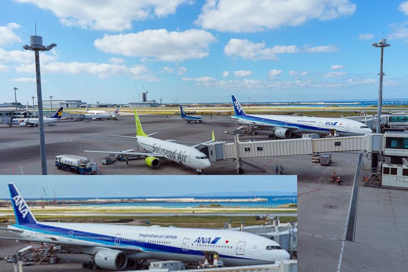
Screen capture of an image exported from Lightroom at 800px, rendered at 800px in Chrome, with the ANA jet blown up into the bottom left to highlight the issue. LOOKS FINE.
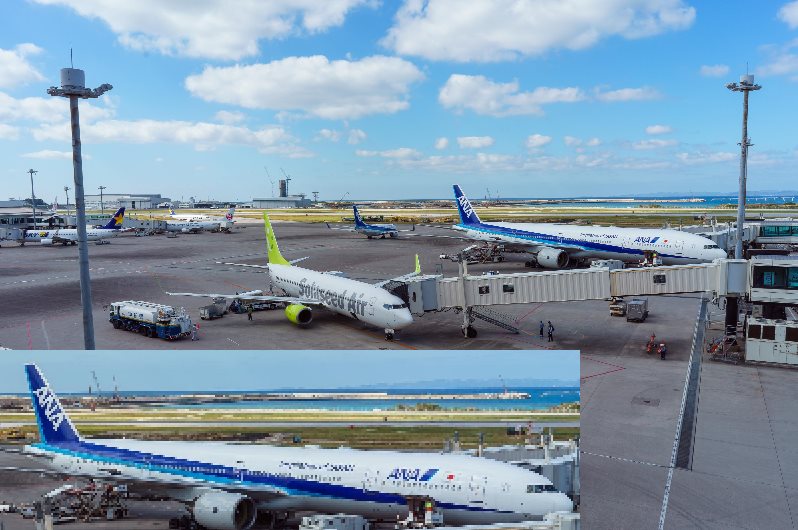
Screen capture of the same image, exported from Lightroom at 1600px, rendered at 800px in Chrome, note the terrible aliasing on the blue paint of the ANA jet and also the wing.
The above is an extreme example, the impact is more pronounced when there are straight lines that are not vertical or horizontal, but assuming I have made my sample jpegs correctly, hopefully you can see and agree that this looks absolutely horrifically additional adjectives here... terrible.
So what is the answer? I tried and tried to find a way to do this in css, there are options for webkit and non webkit browsers to do something with higher contrast or sharper edges, but the impact of them was basically nothing in my testing, or sometimes it made it worse. On top of that is the possibility that sometimes Chrome hands off the job to your GPU, and then its anyones guess.
Therefore, I finally relented, and decided that I need 3 images for every 2......
• For normal screens, thumbnails are 800px, displayed at 800 css px, full size are 1600px, displayed at 1600 css px.
• For retina screens, thumbnails are 1600px, displayed at 800 css px but 1600 retina px, full size are 3200px, displayed at 1600 css px but 3200 retina px.
This works, fine, but you need to get your head around srcset which lets the browser choose which 2 out of 3 pics to use for each user based on their 'media' width, which is css code for physical pixels, as opposed to css pixels.
OK then, the last piece of the puzzle is compression. To understand why additional compression is needed, lets go back to the very start of this diatribic rant (I made up the word diatribic just now).
• An 800 x 533 image has 426,400 pixels.
• A 1600 x 1067 image has 1,707,200 pixels.
• A 3200 x 2133 image has 6,825,600 pixels!!!!!!
Exporting them all as quality 80 from Lightroom, as I used to do, would result in every webpage rendered using srcset for retina users transferring roughly an exabyte of data.
In examining the above chrome rendering issues I found numerous people discussing the 'cost' of supporting retina. I wish I had an actual cost issue where bandwidth was costing me, but I get only 5 readers a day so its not actually a cost issue, just one of convenience. Anyway, the collective wisdom has changed.
It used to be that you must export no less than 80 quality or suffer the wrath of the masses. It is now common practice to export at 30 quality whenever exporting for retina.
My LONG experiments in Lightroom export quality have led me to the following-
• 800 wide 60 quality.
• 1600 wide 30 quality.
• 3200 wide 30 quality.
This is significantly less than I previously thought would be acceptable. I reserve the right to again decide this is unacceptable as soon as banding in sky gradients starts to bother me, but that's a rant for another day!