7 October 2018
St Kilda - Ocean and Garden
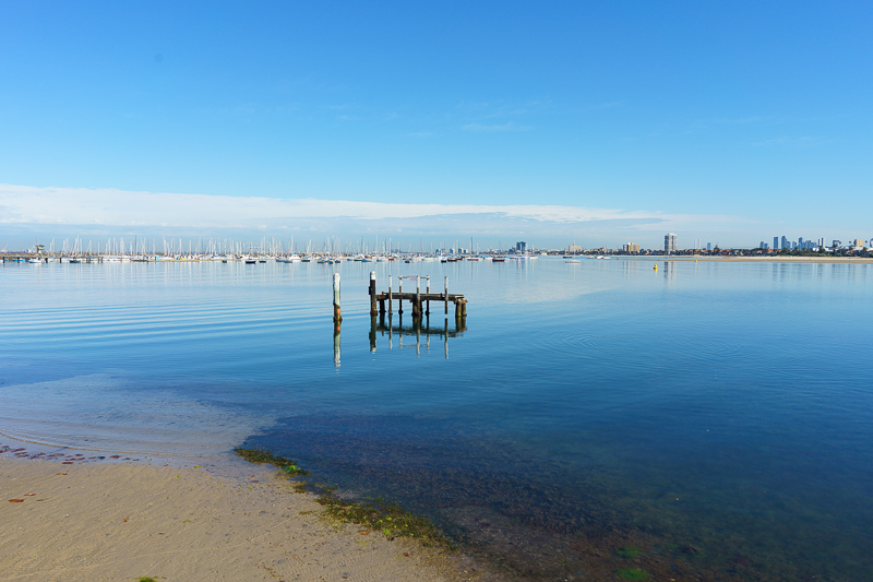
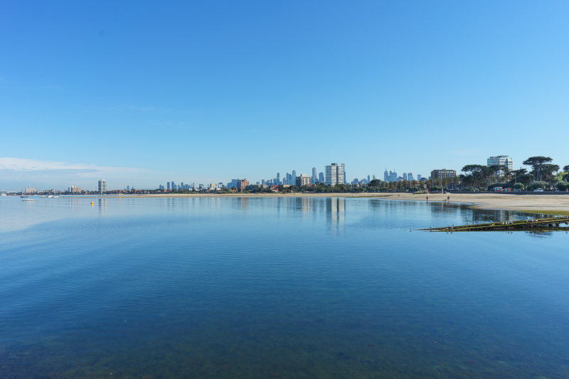
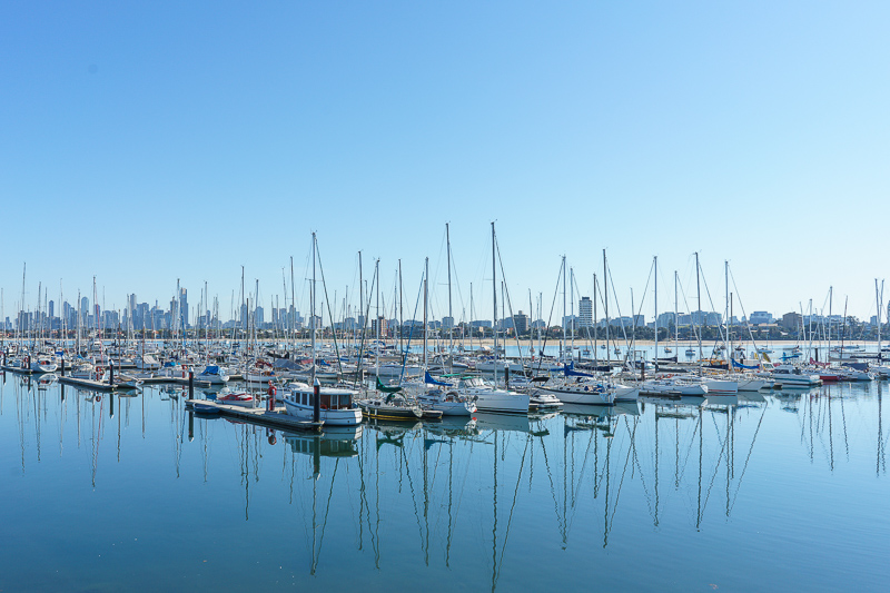
I had to escort charity workers to a location where 15,000 fools line up to look inside houses redecorated by random people competing on a television show for the false praise of the easily influenced. To celebrate I wandered off and took photos of the Ocean and Garden.
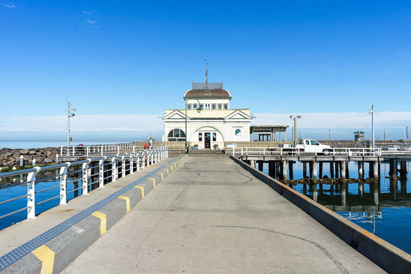
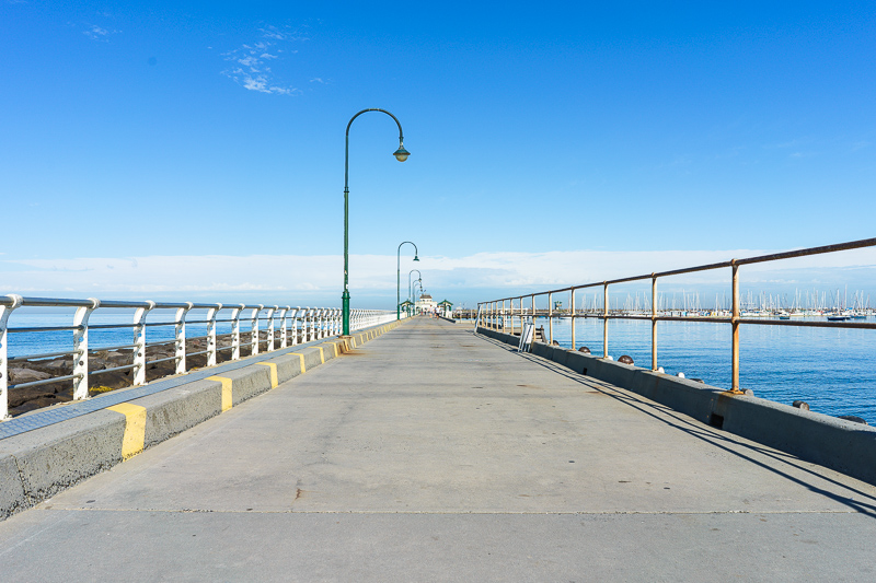
At the end of the pier there is this cafe, a bit like Brighton in the UK, only smaller and not yet burnt down. The car / ute ruins the photo somewhat.
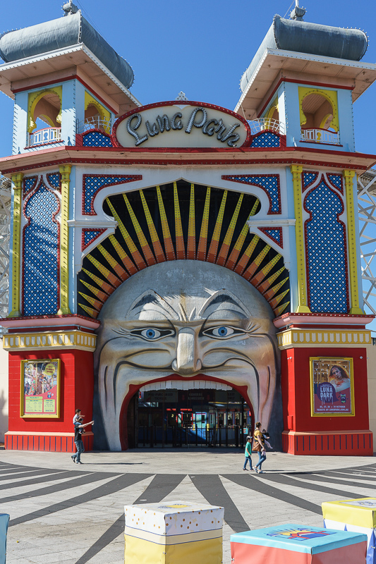
This is the entrance to Luna Park in St Kilda, but you knew that if you have ever been to Melbourne. Everywhere has a Luna Park with the same entrance, where is the original?
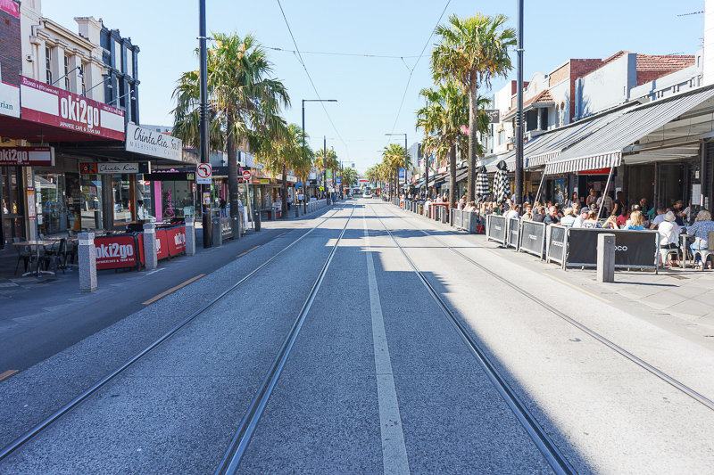
Acland street in St Kilda, famous for its cake shops, tricky situation to photograph, shadow to light, thats why I took the photo though.
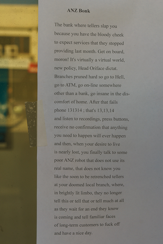
This note was stuck to the window of the ANZ bank, actually lots of copies of this note were stuck all over the bank, some interesting English. I used the white balance selector in Lightroom to get rid of the blue glow from the ANZ signage.
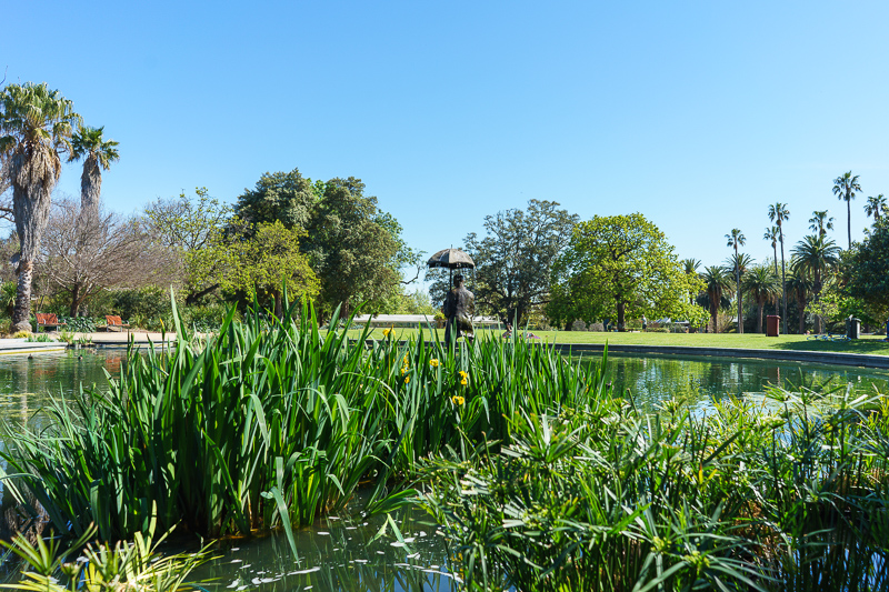
The St Kilda botanic gardens are small but quite nice. The colors in this shot are maybe too colorful, I have selected standard profiles etc. I actually like the bright colors though, hyper quasi realism.
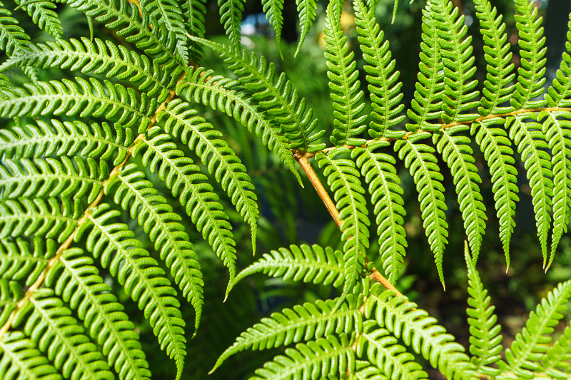
A fern, inside the fern house. My camera is not really suited to macro at all with the current lens. Its great flaw is theres no way after taking a photograph, to review it on the screen and zoom directly to the focus point to pixel peep how sharp your focus is. My Fuji does this and its very useful. In comparing my two good cameras, this is the main feature I miss in the Sony.
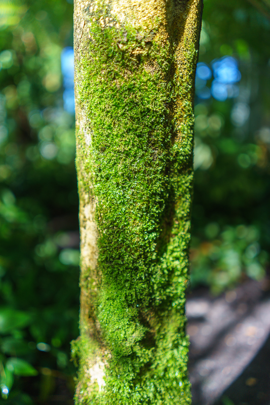
Moss on a tree, f/2 so not much of it is in focus, I was trying to blur the background, not a great subject for that purpose, better on flat subjects.
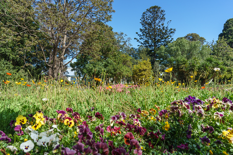
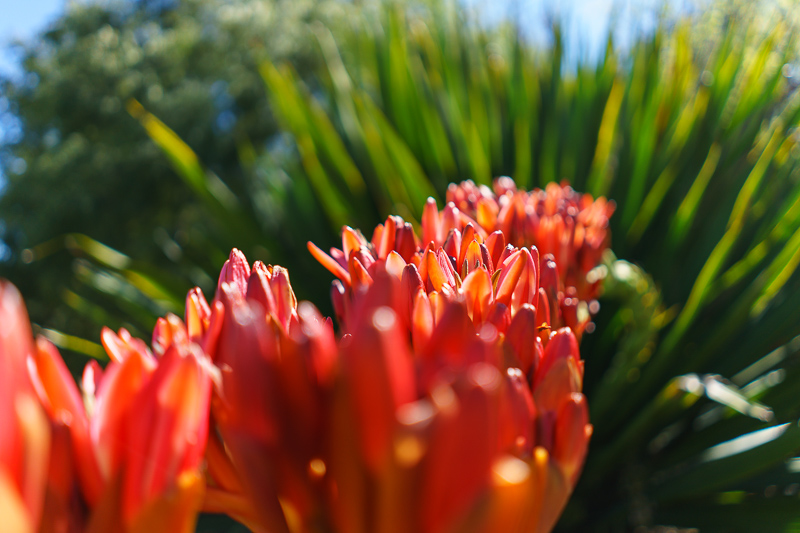
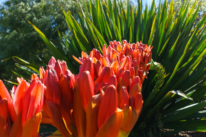
These flowers are past their best, hence I flipped my flippy screen out and got down low to mask how sparsely planted and dead looking they are.
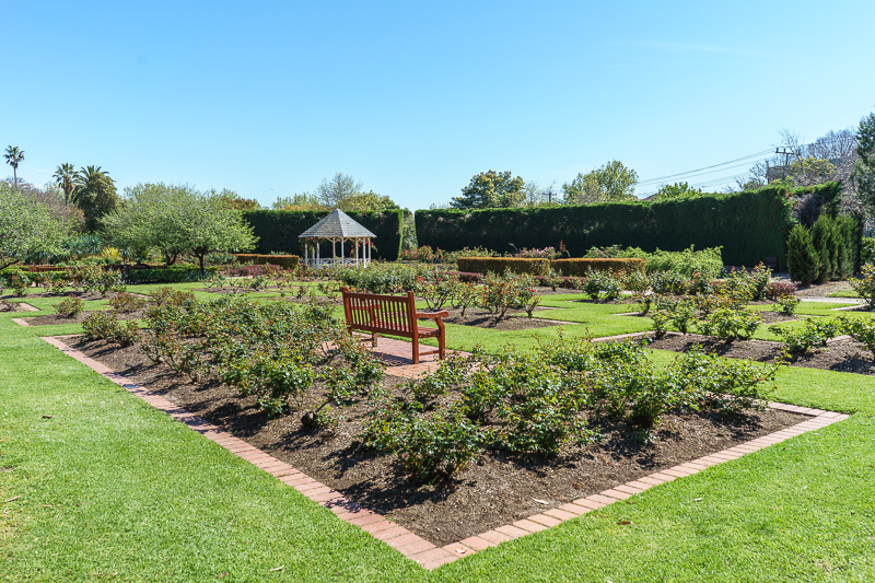
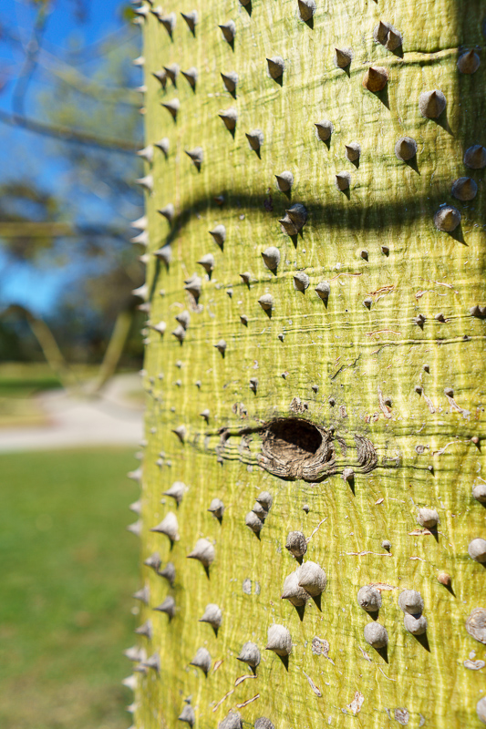
I played with this photo for a while and I am still not satisfied, I will use this to make a bright sun / foliage preset. Currently I think its too sharp.
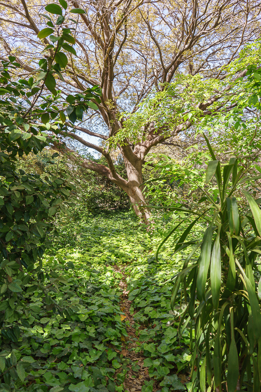
This photo is again an example of where I was looking for tricky light to make some presets to handle it well. I feel as though the white balance / tint needs to be messed with.
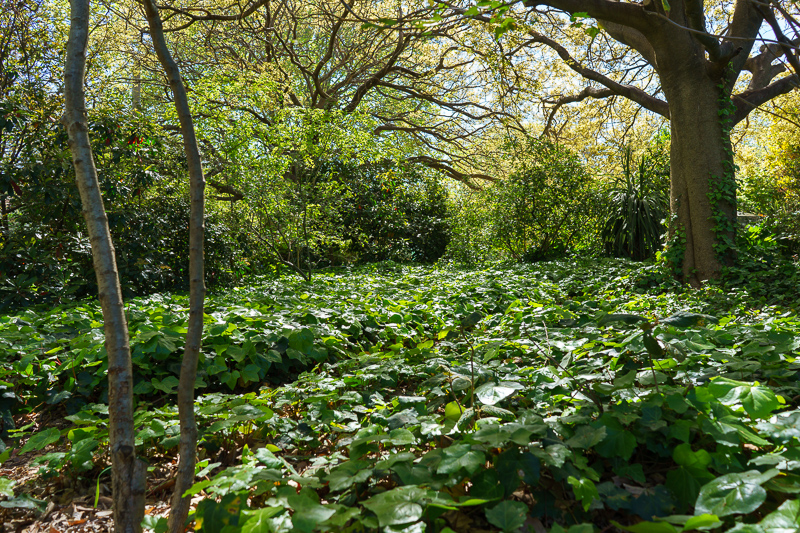
Color looks more natural in this one, but it does look a bit too sharp, probably more so once I export and its resized by lightroom. Now I have a few 'Japan hiking' style photos to mess with.
