5 May 2017
More Melbourne Night
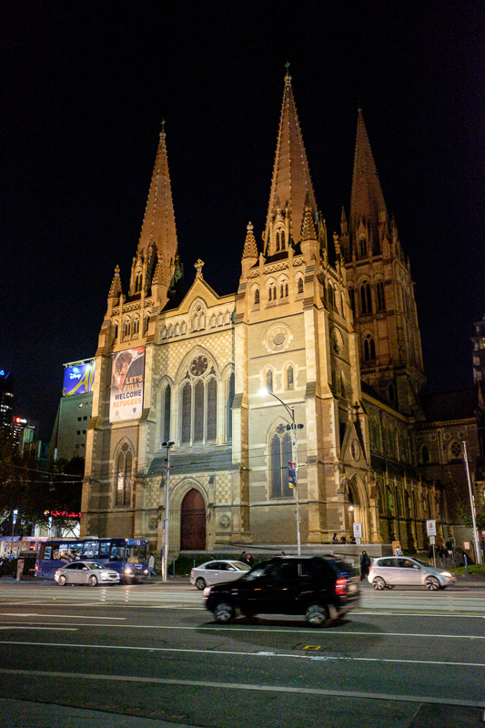
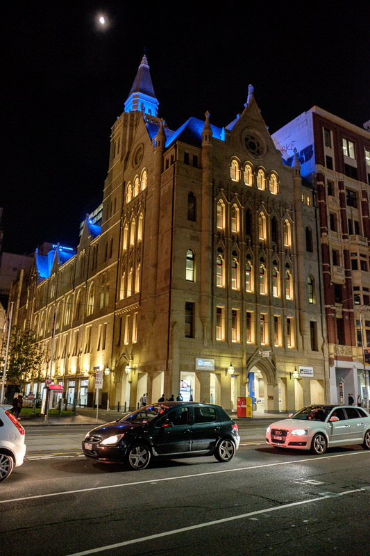
I think I am getting a better idea of how to use the camera at night.
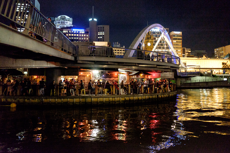
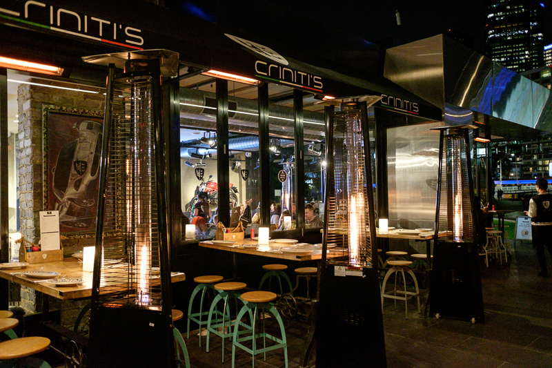
Handheld, but resting my elbows on a railing. This photo is edited to be quite a bit brighter than reality to show the detail inside the bar on the island.
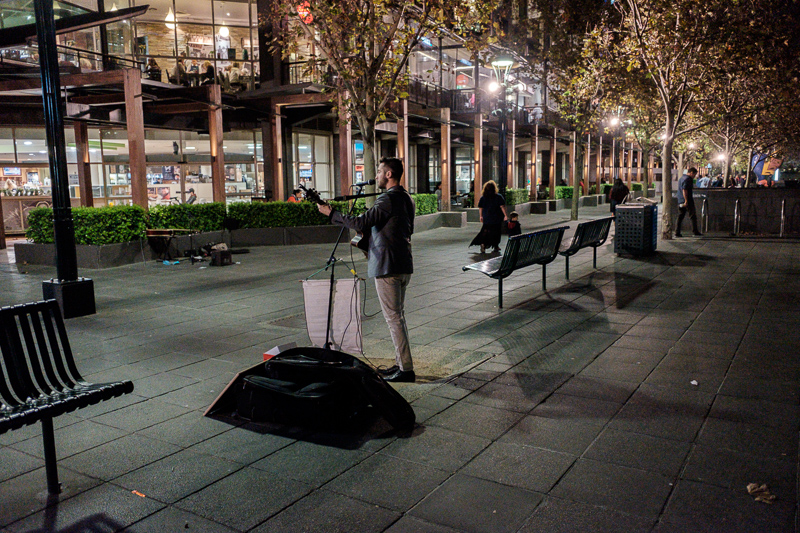
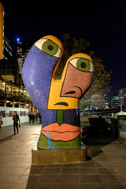
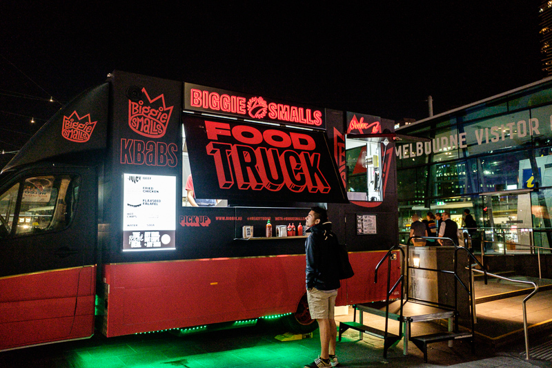
Now its ISO 5000 but still looks great, classic chrome simulation. I gave the guy no money, dont worry.
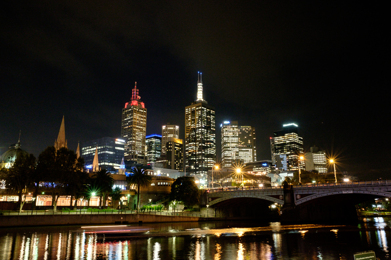
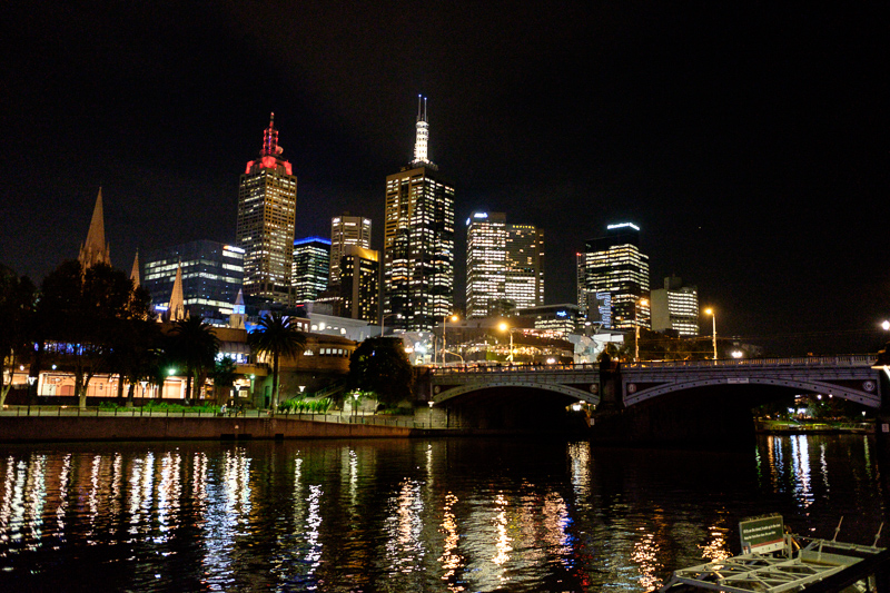
2 seconds at f/11 looks fantastic, but to get this I have to have something to lean the camera on. I can however use the flip out touch screen as a stand which is handy.
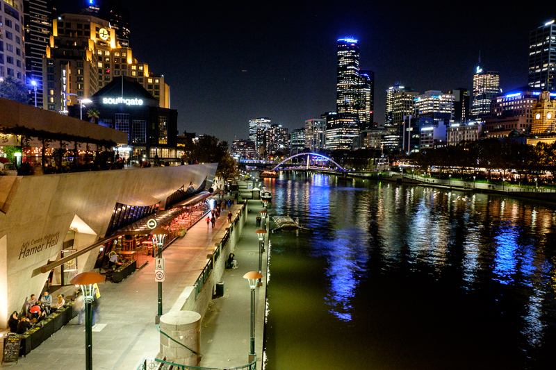
Since this was resting on something, I dont know why I left it set to ISO 2500. Whenever there is something to rest your camera on I am sure it will take fantastic sharp noise free photos.
I should probably do an actual test at f/16 ISO 200 at some point.
I am assuming thats a jet flying past in the centre of the dark sky.
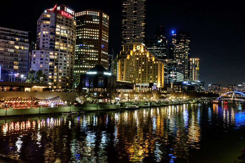
Still quite noisy like the one above, I am not using any NR at all cause apparently its cancer for the eyes.
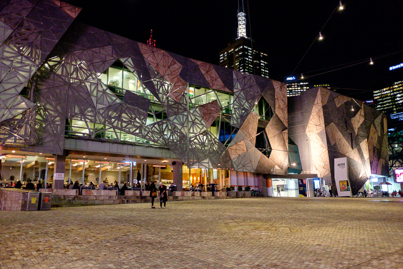
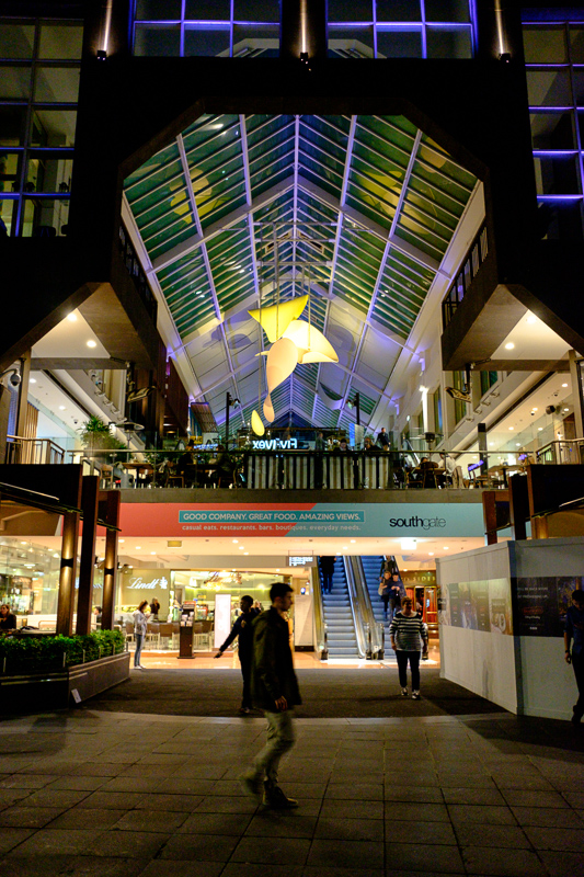
Federation square, well lit by the giant tv behind me. But note this is ISO 4000 and there is basically no noise. Interesting, I would expect the sky to be noisy? Great detail inside the restaurants, I suspect I would not be able to get that sort of dynamic range with my Sony.
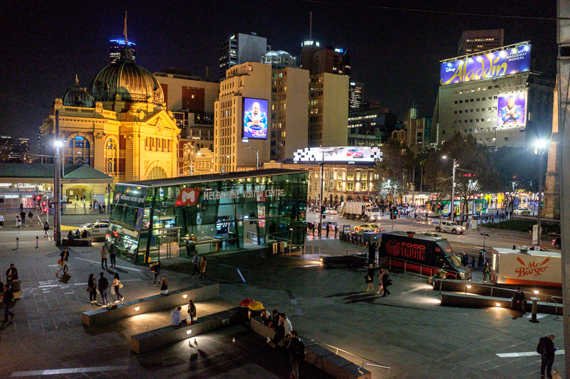
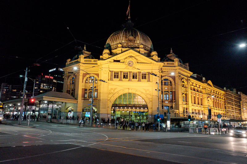
A bit of noise here in the sky, and I have dragged the highlights a long way down due to the advertising screens. But I think this is ok? Somehow its over sharpened.
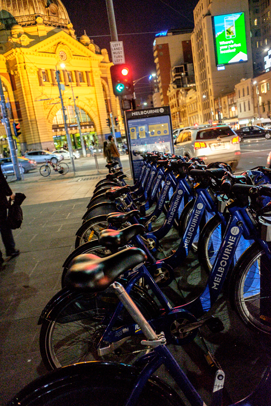
Arty, could probably mess with this more to do something about the color of the station in the background
